3
|
Creating Slides: New Layouts
|
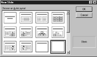
Each time you create a new presentation or add a new slide you are given
the option to select a new layout for each individual slide (see illustration
below). AutoLayouts are predefined slide layouts that are based on the
arrangement of typical objects and data types that are laid onto slides.
There are many auto layouts to choose from here. Click once to highlight
one of the many different slide types available.
PowerPoint gives you a slide already set up to enter your information in
one or more text boxes. Follow the directions on the slide to enter your
data. You can also select and then move and/or resize each of the text
boxes separately to accommodate your needs.
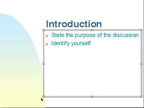
Positioning or Resizing a Text Box or Image
First select the text box or image by clicking on it. A gray line border
with small white boxes ("handles") will appear (see illustration below).
-
To reposition a text box, click on the gray line then drag the box to the
desired position on the slide.
-
To reposition an image, click on the image and drag it where you want it
on the slide.
-
To resize a text box or image, click and drag one of the "handles" to resize
the text box or image. To maintain the text box or image's proportions
drag a corner "handle" rather than a side, top or bottom "handle".
Changing Bulleted Items
If you use a layout that included bulleted items, you can change the style
of bullets used on your slide. Set your cursor on the line of the bullet
you want to change (or highlight all of the bullets to change them all
at once). From the Format menu, choose
Bullet. From the "Bullets
From" drop down list, choose the desired font (such as Zaph Dingbats or
Wingdings) and character.
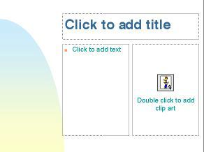
Adding Clip Art
To add some clip art to a presentation, click the New Slidebutton
on the Standard Toolbar (or choose New Slide from the Insert menu) and
choose a format that is predesigned for clipart (such as the one shown
in the illustration below).
PowerPoint comes with a variety of professionally drawn pictures known
as the ClipArt Gallery that you can incorporate into your slides.
To access the clipart gallery, double-click the ClipArt button on the slide.
Locate and select (click) the image you want, then click the Insert
button.
The image will appear in the center of the ClipArt field on the slide.
PowerPoint also allows you to use pictures from other sources such as
scanners, word processors, desktop publishing applications, CD ROMS, etc.
Charts and Graphs
There are two specific elements used when making a chart or graph:
-
The chart itself, which is the graphical representation of your
data, and
-
The datasheet, which contains the actual statistics used to generate
the graph.
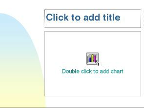
The quickest way to create a chart is by using the AutoLayout Format. Click
the New Slide button on the Standard Toolbar (or choose New Slide
from the Insert menu) and select the layout for creating charts (see illustration
below). Then enter data and view your slide as described below.
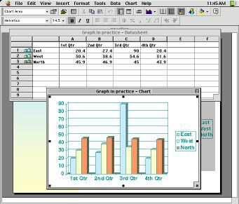
Entering Data
Double-click in the chart button on the slide to start the macro that allows
you to work on graphs and charts. Notice that there is a new toolbar at
the top of the screen, and that there are two windows open: the data
sheet and a graph (see illustration below). To make changes
on the graph, you must change the data sheet.
To enter data in the data sheet just double click on the cell in which
you want to enter data and then type over the existing numbers. The data
sheet is very similar to other spreadsheets such as those in Microsoft
Excel.
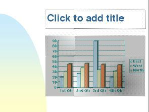
Seeing How It Looks
When you're done entering data, click anywhere on the slide that is outside
of the datasheet. You should see your data represented in a chart (see
illustration below).
If you want to make changes to the graph double-click on it to start the
macro again and then click the view datasheet button in the upper left
corner of the screen. The datasheet should reappear.
Displaying Your Data with a Different Graph
While you're in the macro, you can click the Chart Type down arrow
button on the toolbar and choose (click) a different chart type for displaying
your data. You can also play around with the various toolbar options to
get different effects with your graph.
Tables
Tables are a great way to effectively communicate some types of information.
A table can be used to list a number of specific points with short, explanatory
notes beside them. Using a table, you can quickly format text into perfectly
aligned rows and columns.
To create a table click the New Slide button on the Standard
Toolbar (or choose New Slide from the Insert menu) and choose the layout
that includes a table (see illustration of resulting slide below). Then
follow the steps outlined below.
-
Editing the Table: Double-click the table button in the center of
the slide to start the macro that will allow you to enter data in your
table.
-
 Specifying Rows
and Columns: In the dialog box that appears enter the number of
rows and columns you want and click OK (see illustration, right). Specifying Rows
and Columns: In the dialog box that appears enter the number of
rows and columns you want and click OK (see illustration, right).
-
Entering Data: To enter data in each cell just click within the
cell to position the insertion point and type the data. You can change
the way the text looks with any of the options available in the Format
menu or with buttons on the toolbar. You can resize the cells by placing
your cursor in between the row and column markers on the rulers located
on the side or top of the table. Hold down your mouse button and drag to
resize the cells.
-
Viewing the Table: To see how your table will appear on the slide
double-click on the slide but make sure you're not clicking within the
table editor itself.
Organization Charts
Organization charts are useful to show hierarchies of any kind. For example,
a biology teacher might want to show the hierarchy of species or a computer
science teacher could show a very simple flowchart. You can use the "org
chart" feature any time you wanted to show some kind of link between certain
points.
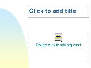
To create an organization chart, click the New Slide button on
the Standard Toolbar (or choose New Slide from the Insert menu) and select
the layout for org charts (see illustration of resulting slide below).
| Note: If you find that auto layout doesn't meet your needs,
you can always draw your own boxes on screen, and draw lines between them
to show their links. You can change the line and box colors and line widths.
Use the drawing tools on screen (if the drawing tools are not visible,
from the View menu, select "Toolbars," then make sure the "Drawing" box
is checked). |
Editing the Org Chart
Double click to start the macro that will allow you to create and modify
your org chart. Notice the new menu options and toolbar choices you now
have. (If the drawing tools are not visible, under the View menu,
select Show Draw Tools.) Click on any of the boxes to begin entering
information (replacing the "placeholder" text).
Adding a New Box, Changing a Link Style,
or Modifying the Look of a Box
To add a new box, click on one of the "relationship" button options. Then
click on the box from which you want the new one to link. To change the
way boxes are linked, click on a box and then go to the Styles menu
and select a new style. You can change the thickness, color and type of
line or box from other menus at the top of the screen.
Viewing the Org Chart
Before leaving the org chart macro, from the File menu choose (click)
Update.
Then from the File menu, choose
Exit and return (in Windows)
or Quit and Return to filename (on a Macintosh). If you need
to make changes to the org chart, just double-click it to restart the mini-program.
Don't forget to "Update" again before you go back to the slide view. |