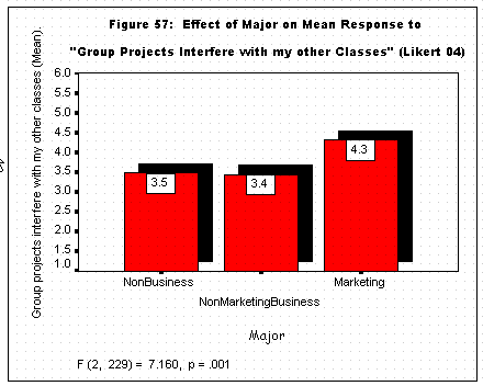
Creating
one bar graph of several means from one variable, e.g., for a significant
ANOVA main effect. Creating
one bar graph of several means from one variable, e.g., for a significant
ANOVA main effect. |
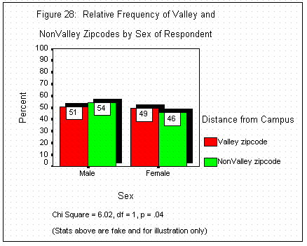
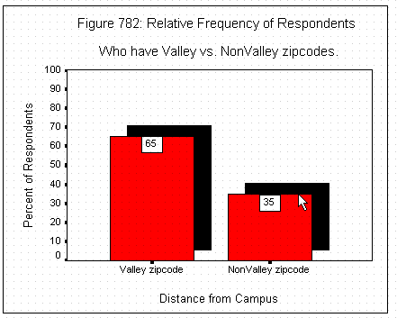
Graphing
percentages (relative frequencies) instead of means, as is often necessary
for many demographics, e.g., for a significant Chi Square main effect. |
Creating
one bar graph of means for a significant ANOVA two-way interaction. |