universal-design-center

  • keyboard accessibility

Web Accessibility Criteria - Keyboard Accessibility

  Description

All functionality of web content must be navigable and operable through a keyboard interface. Keyboard accessibility is critical to ensure all users have access to information without requiring a mouse. To be keyboard accessible a web page must not only be keyboard operable it must also incorporate the following: a visible keyboard focus, appropriate tab order, and avoid keyboard traps. 

Keyboard Focus

To ensure keyboard accessibility it is important that keyboard focus is present on a web page. Keyboard focus allows a visual indication of the user’s location on the webpage. When an item has keyboard focus, it can be activated or manipulated with the keyboard. A basic focus indicator is provided automatically by the web browser and is typically shown as a border. However, keyboard focus indicators vary and can take different forms. Although keyboard focus varies by browser, there are web kits that alter the CSS which will allow keyboard focus to be more apparent.

Tab order

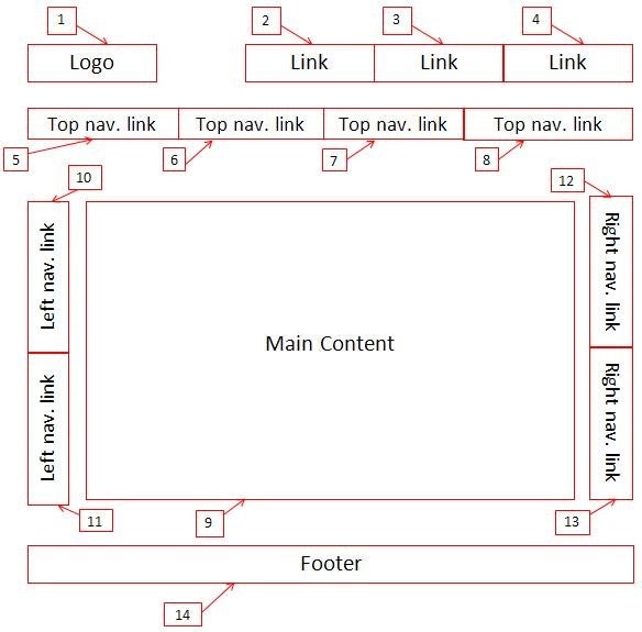
Tab order is important for proper navigation through a keyboard interface. The keyboard tab order must be coordinated with the structure of the webpage. The default keyboard navigation order must be logical and intuitive. The tab order should follow the visual flow of the page: left to right, top to bottom - header first, then main navigation, then page navigation (if present), and finally the footer.

Avoiding Keyboard traps:

It is important that keyboard traps be avoided to ensure no barriers to navigation through a keyboard interface. A “keyboard trap” occurs when a person who uses a keyboard cannot move focus away from an interactive element or control using the keyboard alone. Keyboard traps often occur in calendar widgets or dialogue boxes. For example, the user expands an accordion item, but is unable to move to the next item using the “tab” key or unable to collapse it using the “esc” key. 

back to top

  Why is keyboard accessibility important?

Keyboard accessibility is one of the most important aspects of web accessibility. Not all users navigate the page with the mouse or a trackpad; some users only rely on keyboard to navigate. Many users with motor disabilities rely on a keyboard. Assistive technology users will also typically use a keyboard for navigation. In addition to traditional keyboards, some users may use modified keyboards or other hardware that mimics the functionality of a keyboard.  Moreover, ensuring keyboard focus, tab order and no keyboard traps is important for the following reasons: 

  • Keyboard focus will primarily allow sighted users to know which element from the webpage has focus. If keyboard focus is not present or is difficult to visually see, it becomes a barrier to a user and makes it difficult to access information through a keyboard. 
  • Keyboard tab order allows users to properly navigate the page. If the tab order is incorrect and instead starts on the top of the page and then directs the user to the bottom of the page, users will have missed the content in-between those two sections or the user will be forced to use the “tab” key numerous of times before they reach their destination.
  • Keyboard traps prevent the user from navigating further in the page.  A user may be forced to perform various workarounds to access the information or may be completely blocked from navigating through the entire webpage again. 
back to top


Section 508/WCAG 2.0 Summary of Requirement

All functionality of the content is operable through a keyboard interface without requiring specific timings for individual keystrokes, except where the underlying function requires input that depends on the path of the user's movement and not just the endpoints (WCAG)

Best Practices

The best practices for keyboard accessibility include the following: 

  • All interactive content should be accessible via a keyboard interface.
  • The keyboard focus should be visible for all sighted users. Although the focus varies from browser to browser we recommend using CSS to make the keyboard focus more visible by adding a background color or any style to make the focus visible.
  • To ensure keyboard focus is present on a page avoid using the outline:none attribute because it removes the keyboard focus on a webpage.
  • The tab order should have the same structure of reading a book. It should be from left to right from top to bottom.
  • To adjust the tab, order the following methods can be applied using the tabindex attribute*:  
    • tabindex="1" (or any number greater than 1) defines an explicit tab order.
    • tabindex="0" allows elements besides links and form elements to receive keyboard focus. It does not change the tab order, but places the element in the logical navigation flow, as if it were a link on the page.
    • tabindex="-1" allows things besides links and form elements to receive "programmatic" focus, meaning focus can be set to the element through scripting, links, etc.
  • To make it easier to navigate via the keyboard provide a "skip to main content" link at the top of the page refer to Web Accessibility Criteria Link Functionality for more information.  
  • Verify that keyboards can navigate and interact with the webpage on their own without the use of a mouse.
  • If a popup dialogue box appears on the webpage users should have the ability to navigate through it and able to exit the dialogue box using keyboard only.
  • Avoid creating Flash only webpages as they are not keyboard accessible.

* NOTE: Tabindex values above 1 are not recommended

back to top


Examples

Keyboard focus


The video below showcases what keyboard focus and a correct tab order look like.  


Tab order

 Tab order structural design example

Keyboard Trap 

General Service Administration Keyboard Trap Example

The link above is an example of a keyboard trap loop on the General Service Administration website. The example is, that keyboard users are in a continuous loop when they try to navigate through a set of links. Users are able to disable to keyboard trap by selecting one of the links on their page. 

Interactive Accessibility Keyboard Trap Example

The link above is an example of a keyboard trap from the Interactive Accessibility website. Keyboard users are able to navigate to the first form field "Last Name" and the second form field "Last 4 digits of your Tax ID." After the user reaches the second form field, they are unable to navigate between the first form or the third form. The user is unable to move forward with the form fields, leaving the user stuck on the second form

Github Keyboard TrapExample

The link above is an example of a keyboard trap from Github. On the page, there are two links, the first link is "Trap" the second link is "Honey". When the keyboard users have the focus on the first link and try to shift the focus away from the link, the link is activated. Users are unable to move the keyboard focus away from the first link, leaving the second link unnavigable. 

back to top


How to Test

Manual Test

Testing for keyboard accessibility requires a manual and visual review of a webpage. When testing, the following questions must be asked: 

  1. When using the "tab" key only, can you navigate to all interactive elements on the page?   
  2. Does the tab order match the logical reading order of the page?   
  3. Do all keyboard interactive elements display visual keyboard focus? Or are there any instances when key board focus disappears?   

  4. Is the visual keyboard focus easy to identify?   
  5. During the navigation, are there any instances when you become trapped in an element?   

When all functionality of content can be operated through a keyboard, or its alternative, it is considered to be accessible. 

WebAim Standard Keyboard Shortcuts Table

Webaim provides a list of the standard shortcuts used to interact with a website via the keyboard. It is important to be familiar with these when conducting accessibility test for keyboard functionality.  A summary of the most important Keystrokes in the Webaim Table is below: 

InteractionKeystrokesNotes for Accessibility 
Navigate to interactive elements
  • Tab
  • Shift + Tab - navigate backward
  •  Keyboard focus indicators must be present.
  • Navigation order should be logical and intuitive.
LinkEnter Must activate activate the element 
ButtonEnter or Spacebar
  • If an elements has the ARIA role="button", ensure the elment can be activated with both key commands.
Checkbox
  • Tab to move to next element 
  • Spacebar - check/uncheck a checkbox

TIP: Checkboxes should be used when one or more option can be selected.

Radio buttons
  • / or / - select an option.
  • Tab - move to the next element.

TIP: Radio buttons should be used when only one option from a group can be selected.

Select (dropdown) menu
  • / - navigate between menu options
  • Spacebar - expand
  • Esc- collapse


back to top


Resources