STUDENT MARKETING

myNorthridge Portal Style Guide and Glossary

Updated July 2015

The myNorthridge Portal is designed to provide access to a wealth of campus resources and services in a centralized location. The myNorthridge Student Portal Style Guide and Glossary serves as guidelines to keep the portal design and content in line with the university’s goals for improving accessibility, increasing consistency and implementing branding initiatives. If you have any questions, please contact Student Marketing & Communications at (818) 677-5848.

Branding

Logo treatment

Size adjustment

For optimal digital reproduction, do not scale smaller than 27 pixels. Each logo must be scaled proportionately. Hold down the shift key to make the logo larger or smaller.

CSUN logo

myNorthridge Portal logos

Moodle logo

 Ask Matty logos

Color theme

Palette

CSUN Red

# D00D2D
R 208
G 13
B 45 

CSUN Red color swatch

Black

#000000
R 0
G 0
B 0 

Black color swatch

White

#FFFFFF
R 255
G 255
B 255 

White color swatch

Gray

#656868
R 101
G 104
B 104 

Gray color swatch

Gradient

  1. # 7D2022
    Location 0%
  2. #9F262A
    Location 19.66%
  3. #EC1C24
    Location 66.85%

Red gradient swatch

  1. #808080
    Location 0%
  2. #606060
    Location 48.85%
  3. 515151
    Location 49.14%
  4. #444444
    Location 90.26%
  5. #454545
    Location 100%

Gray gradient swatch

Link

Visited link

#550000

Visited link color swatch

 Rollover link

#FF0011

Rollover link color swatch

Icons

Content and style

If you cannot find the icon you need, please contact Student Marketing & Communications.  All icons must be approved by the student portal and mobile app planning committee and University Advancement. Icon size, including border, must not exceed 50 by 50 pixels. Stroke color is #5F605F and stroke size is two pixels wide. See the Icon Library, for the most up-to-date portal icons.

Student portal

Navigation

Header

Content and style

All links and banner artwork must be approved by the student portal and mobile app planning committee.

Applicant and admitted student portal header

Current student portal header

Tab style

Typography

Use Verdana Bold 15/18 pixels. Text should be white and all caps.

Round corner adjustment

Each tab must have round corners. When scaling or resizing tabs in Adobe Illustrator, use the direct selection tool to move the points that make the tab larger or smaller. This will maintain the curve of the corners. The radius of the round corner is 12 pixels. Start and end of the tab navigation bar should prescribe to the following layout.

Padding

Padding between the top and bottom, and left and right, of the text should be equal.

Style

The tab that is currently open must be black. The rest of the tabs should be the gray gradient indicated in the section Color Theme under Branding.

Applicant and admitted student portal tabs

Current student portal tabs

Buttons

Legend

Add content
Add Content button

Hide content
Hide Content button

Logout
Logout button

Ask Matty
Ask Matty button

Pagelet elements

Diagram

Pagelet anatomy

Each pagelet features eight key elements, which the style guide has divided into two categories: Typography and Graphic Elements.

Typography consists of headers, subheaders, subheader headlines, body copy and links. Graphic elements consist of header bars, subheader bars and buttons.

Round corner adjustment

Each pagelet must have round corners. When scaling or resizing tabs in Adobe Illustrator, use the direct selection tool to move the points that change the size of the tab. This will maintain the curve of the corner. The round corner radius is 15 pixels.

Pagelet anatomy diagram

Padding

As a general rule, padding around all pagelet elements should be 15 pixels except between the left edge of the pagelet and the subheader bar. For example, text should have 15 pixels of padding from the edge of the pagelet or the left side of the scroll bar. There should be 10 pixels of padding around the image or text.

Pagelet padding diagram Pagelet padding diagram

Buttons

Legend

Refresh
Refresh button 

Expand
Expand button

Minimize
Minimize button 

Close or delete
Close or delete button

Expand subheader bar

Minimize subheader bar

Pagelet with all buttons

Tab style

Typography

Use Verdana Bold 12/12 pixels.

Alignment

Tab navigation bar and content must be flush left.

Padding

Padding between the top and bottom should be equal.

Style

The tab that is currently open must be CSUN Red. The rest of the tabs must be black. For examples, see the section Color Theme under Branding.

Social media pagelet with four tabs 

Typography

Header

Use Verdana Regular 12/14.4 pixels.

Subheader

Use Verdana Regular 12/14.4 pixels.

Subheader headline

Use Verdana Bold 12/16 pixels.

Body copy

Use Verdana Regular 12/16 pixels.

Hyphenation

Avoid hyphenation. Instead move to the next line.

Pagelet typography diagram 

Alignment

This may vary with each pagelet. As a general rule, subheaders and body copy should be flush left. Sometimes, for aesthetic reasons, the body copy under a subheader bar is indented. For example, see the following pagelet on the right, My Announcements.

Pagelet alignment diagramPagelet alignment diagram

Links

Standard link

Use Verdana Bold 11/14 pixels. Links must be unlined and CSUN Red, see the section Color Theme under Branding.

Rollover link

When rolling over a link, the font should not change. However, the color will change from CSUN Red to the rollover color. For examples, see the section Color Theme under Branding.

Visited link

After a link is visited, the font weight should change from Bold to Regular. The color will also change from CSUN Red to the visited link color. For examples, see the section Color Theme under Branding. The link should also remain underlined.

Pagelet link colors 

Rollover

Typography

Use Verdana Bold 12/20 pixels for the body copy. Text should be black.

Use Verdana Regular 10/12 pixels for the Dismiss button in the top right corner. The color of the text in the Dismiss button should be gray. See the section Color Theme under Branding.

Padding

Padding from the top edge of the rollover to the text should be 30 pixels. Padding from the left, right and bottom edge of the rollover should be 20 pixels. If there is a paragraph break, there should be 30 pixels between the paragraphs.

There should be 7.5 pixels of padding between the Dismiss button and the top and right edges of the rollover and 5 pixels between the text Dismiss and the X.

Style

The rollover must be white and set at 90 percent opacity. Stroke size of the border must be 0.75 pixels. Use the X icon to accompany the text for the Dismiss button.

Pagelet rollover diagram

Video

Style

Refer to Student Portal.

Size

The width of the video must be no smaller than 200 pixels.

Padding

There should be at least 30 pixels around the video.

Pagelet video

Lightbox

Style

Refer to Pagelet Elements. The background color behind the lightbox should be black and set at 50 percent opacity.

Pagelet lightbox

Photo standard

Size and resolution

Portal images must be 81 pixels by 54 pixels at 72 dots per inch (DPI).

Content

Portal images must be approved by Student Marketing & Communications (SM&C). SM&C reviews each image to ensure that it meets publication requirements and represents the scholarship, price and diversity of the university and its students. 

Pagelet photos

Do not use clip art of any kind. If you cannot find the image you need, please contact SM&C.

Clip art 

Border

Portal images with round corners also must have a border. The stroke color is #5F5F5D and stroke size should be 0.75 pixels.

Special pagelets

Student highlights

Typography

Pagelet header

Use Verdana Bold 12/11.4 pixels.

Headline

Use Verdana Bold 12/17 pixels.

Deck

Use Verdana Bold Italic 12/17 pixels.

Body copy

Use Verdana Regular 12/17 pixels.

Hyphenation

Avoid hyphenation. Instead move word to the next line.

Student highlight pagelet diagram 

Links

Standard link

Use Verdana Bold 11/17 pixels for tracking. Links must be underlined and CSUN Red. For example, see section Color Theme under Branding.

Rollover link

When rolling over a link, the fond should not change. However, the color should change from CSUN Red to the rollover link color. For example, see section Color Theme under Branding.

Visited link

After a link is visited, the font weight should change from Bold to Regular. The color will also change from CSUN Red to the visited link color. For example, see section Color Theme under Branding. However, the link should remain underlined. 

Photo standard

Size and resolution

Portal images must be 92 pixels by 92 pixels at 72 dots per inch (DPI).

Content

Portal images must be approved by Student Marketing & Communications (SM&C). SM&C reviews each image to ensure that it meets publication requirements and represents the scholarship, pride and diversity of the university and its students.

Student highlight photo Student highlight photoStudent highlight photoStudent highlight photo

Do not use clip art of any kind. If you cannot find the image you need, please contact SM&C.

 Clip art

Border

Portal images for the student highlight pagelets do not have round corners, strokes or decorative edges.

Glossary and style guide

Objective

To establish a consistent vocabulary for the current-student myNorthridge Portal
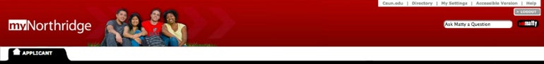
Glossary and style guide

banner

A feature dedicated to sharing campus events

click

To comply with Web accessibility guidelines, do not use when referring to the usage of a cursor or a mouse to access features or links on the portal. Some alternatives include choose, select or go to.  

CSUN email 

Use when referring to the official university email for CSUN students.

cursor or mouse

Do not use. See definition for click.

departments

Follow the preference of each department. If not listed, please call the unit to confirm name.             

­­­Admissions and Records
Alumni Association
Associated Students
Athletics
Career Center
Delmar T. Oviatt Library  
Department of Police Services
Disability Resources and Educational Services
Educational Opportunity Program  
Financial Aid & Scholarship Department
Graduate Studies
International and Exchange Student Center
IT Help Center
Klotz Student Health Center
Learning Resource Center
Matador Involvement Center
National Center on Deafness
Office of Government and Community Relations
Office of Institutional Research
Office of Student Involvement and Development
Office of the Vice President for Student Affairs
Parking and Transportation Services
Student Housing
Student Marketing & Communications
Student Outreach and Recruitment
Testing Center
The Tseng College
The University Corporation
University Advancement
University Cash Services
University Counseling Services
University Student Union
Veterans Affairs             

FAFSA

Upon first reference, the Free Application for Federal Student Aid (FAFSA). In subsequent references, shorten to FAFSA.
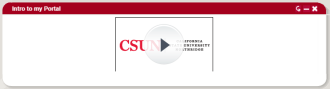
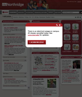
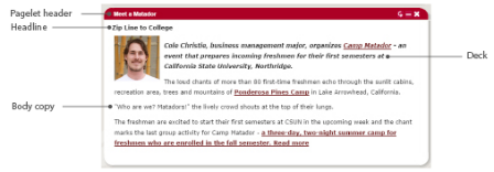
lightbox

A content box (see the definition for pagelet) that pops up on the portal either to push vital safety information in case of an emergency, or maximize a video or text for better viewing
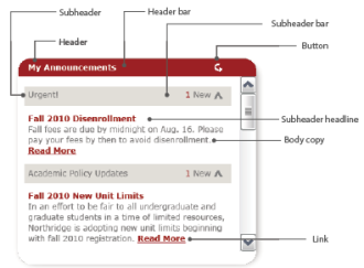
links

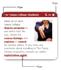
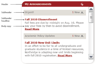
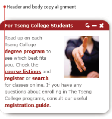
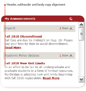
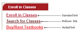
Should always be CSUN Red, underlined and bold. See the section Pagelet Elements under Student Portal. When mentioning a department, campus resource or organization, always include a link. For actionable items, always include a link to a website and a due date.
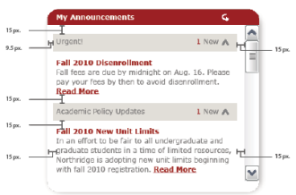
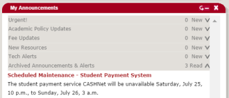
My Announcements

A content box (see definition for pagelet) dedicated to sharing the latest information about campus resources and news, academic policies, fees and portal outages. 

My Checklist

A content box (see definition for pagelet) dedicated to a checklist of actionable items, such as fee payment reminders, enrollment and advising appointments

MyNorthridge Portal or portal

Do not use myNorthridge, Portal or MyNorthridge Portal

myNorthridge Prospective Student Portal

Features its own set of style standards. Not to be confused with the current-student portal.

online learning or e-learning

Use when referring to online courses
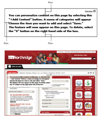
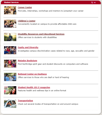
pagelet

Boxes — comprising text, hyperlinks and images — located on each tab. Users can personalize boxes by adding, deleting or minimizing, with the exception of My Announcements and My Checklist.

pagelet titles

Should not exceed three words. The pagelet title should succinctly describe the content of the pagelet.

pagelet content

Should be clear and concise. Ideally, pagelets should only highlight and direct users to resources found on another website without rehashing information. Sometimes, this is done with just a hyperlink. Some content may require a definition (example: Disability Resources and Educational Services serves CSUN students with disabilities.)

SOLAR

Upon first reference, the SOLAR Student Center. In subsequent references, shorten to SOLAR.

student ID

A unique, nine-digit number that matches a student’s identity to his student ID or her academic record

register or enroll

Use interchangeably when referring to signing up for a class.
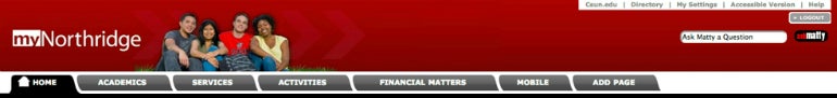
tab

One of the following dividers on the navigation bar: Home, Academics, Services, Activities, Financial Matters, Mobile and Add Page 

user ID

An alphanumeric name that is used along with a password to log in to CSUN websites. 

Content requests

Guidelines

Use EBSuite to request new portal content and changes (e.g., hyperlinks, images, pagelets and text). After you log in, go to Create a new case, select myNorthridge Portal as the Product/Category, and direct the request to Student Affairs IT/Student Marketing & Communications in Case Details. 

EBSuite ticket example