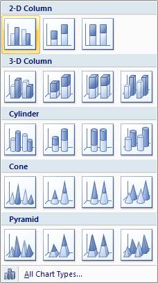
Once you have your data highlighted, in 2007, click on the insert tab above the top tool bar. The following screen will appear.
From the “Column” option among the Chart types, select a 2D column known as clustered column. It should be the first one that appears. Click it once and a two-column, clustered bar graph will appear.
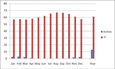
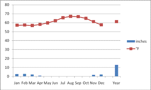
This of course has some problems. You’ll need to make the tall, red bars that represent temperarture into a line graph. You’ll also need to put a second axis on this chart to make it so readers can see that inches of rain is on measured on the left axis and degrees Fahrenheit is measured on a secondary, right hand axis. You also need a title and some information. Here’s how in the ‘wonderful new world of Excel 2007”.
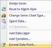
Click once on the red bars.
This will activate or ‘highlight’ them.
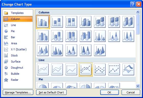
Right click to open a small dialog window … . Select Change Series Chart Type. Chose from the box that opens, the “Line
with Markers” option. See below and
click OK. You should now have a red line
with points showing temperature.
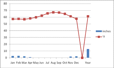
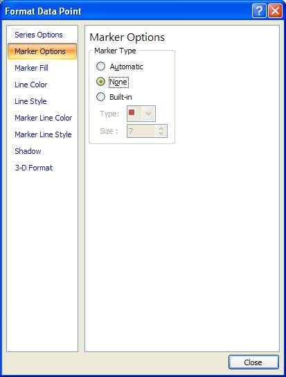
Next, to separate the Year-long average from the monthly data, double click on the point between December and Year. You’ll want to reformat that, so it disappears. Select Marker Options and select None. Then select, Line Color and then select No Line from the options available. Click back on your graph, this time selecting the point for Year-end temperature, remove the line from it.
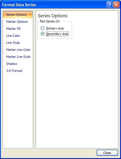
Next add a secondary axis so you can separate the axes for
temperature and rainfall. Click on the
red temperature line to activate it.
From the popup dialog box, chose “Secondary Axis” from the Series
Options.
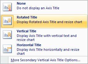
In the Layout window (Layout tab above the toolbar), click on the Axis Titles Icon, which will produce a drop down menu or two. Select from the options available for the primary vertical axis, a rotated title. You’ll have to double click on the box created and add “Precipitation” to the newly added axis title. Repeat this process for your secondary axis, this time inserting the word “Temperature”.
Now you only have a couple more steps to creating a cool climograph. You’ll need a title, so click on the “layout” button at the top of the toolbar. You can select from the drop down “Chart Title” option, then select the “Above Chart” option.
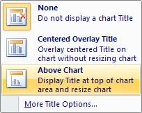 Here you should type “Santa Monica
Pier”. I think a nice touch is to add
the altitude, latitude and longitude coordinates for this location as well (see
screen capture below).
Here you should type “Santa Monica
Pier”. I think a nice touch is to add
the altitude, latitude and longitude coordinates for this location as well (see
screen capture below).
If it all goes well, you should have a climograph that looks like the following.

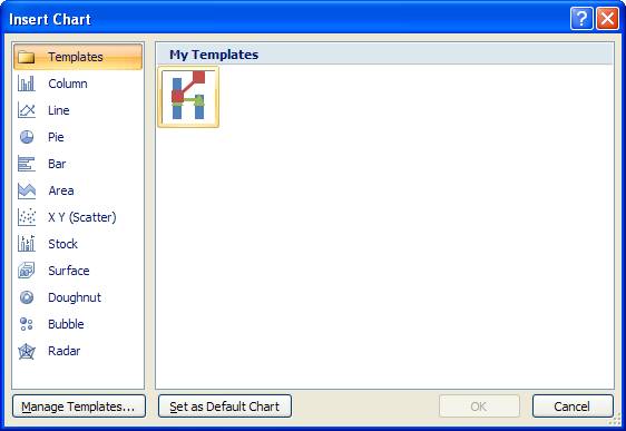
So…when you have gotten it the way you like it, you can save the climograph as a template. Chose a name like “Steves_climograph_template”. This allows you to save the look of your climograph and you can add new data to another file and apply this template to it and it will look very similar to the one that you just perfected.
To do so, highlight your data as you did at the beginning of this exercise, Click on any of the chart types and select “All Chart Types” from the bottom of the drop down menu. An “Insert Chart” window will open. Select “Templates” and then pick the template you saved before.
Either click on the “Layout” tab above the tool bar.