Stuve Diagrams
Stuve Diagrams are one type of thermodynamic diagram used
to represent or plot atmospheric data as recorded by weather balloons in their
ascent through the atmosphere. The data
the balloons record are called soundings.
The example below shows atmospheric data from the Miramar
Naval Station near San Diego, as recorded on July 21, 2004. (Ideally, we would discuss a diagram based on
data from the
 Fig. 1
At first glance, this diagram probably appears rather cluttered and somewhat difficult to understand. But let’s break it down layer by layer, and look at it more closely.
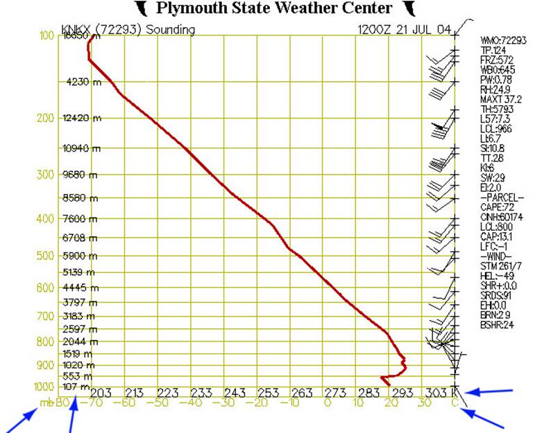 Fig. 2
Figure 2 shows our diagram at its most basic. The left (Y) axis represents air pressure in millibars and elevation in meters, while the X-axis shows temperature in Celsius and Kelvin. Since the horizontal lines which originate from the Y-axis relate to air pressure, they are also called isobars. The vertical lines which originate from the X-axis are called isotherms, as they are lines of constant temperature.
Along the right side of the chart are barbs showing wind speed and direction. The red line shows how the air temperature varies with altitude. Note that on this example chart the temperature at first decreases with altitude, then begins to increase (an inversion layer) around 550m, then decreases again by about 1300m on up.
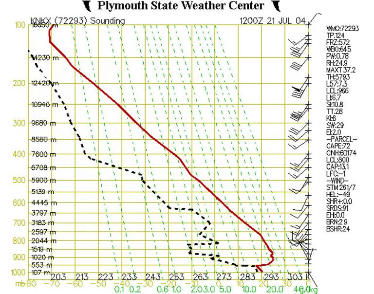 Fig. 3
Figure 3 shows our diagram with some added information. The dashed green lines represent the saturation mixing ratio, which is the amount of water vapor which would need to be present in a parcel of air in order for the air to be “saturated” or, in other words, to produce a cloud, or fog, or rain. If one happens to know a particular air parcel’s pressure and temperature, then the saturation mixing ratio can be read directly from the chart. For example, if the pressure of an air parcel is 950 mb, and its temperature is 24˚C, then its saturation mixing ratio would be 20g H20/kg of dry air. Table of Saturation Mixing Ratios.
The dashed black line shows how the temperature of the dew point changes with altitude. If one knows the dewpoint and pressure of an air parcel, then one can tell how much water vapor the air actually contains. This is the actual mixing ratio. So, using Fig. 3 above, where the pressure (P) is 950 mb, and the dewpoint (Td) is 9˚C, then its actual mixing ratio would be 8 g/kg.
If the actual mixing ratio is the same as the saturation mixing ratio, then the air is said to be “saturated” and a cloud (or fog) will normally form. In this example, the air at 950 mb is “unsaturated” because its actual mixing ratio is less than the saturation mixing ratio.
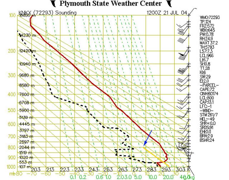 Fig. 4
In Figure 4, we’ve added additional elements to the chart. The yellow line represents the temperature that an air parcel would have if it were lifted from near the ground (around 950 mb or 500 m). The solid diagonal lines are called dry adiabats and show the rate at which dry (or “unsaturated”) air will cool down as it rises up through the atmosphere. This rate is approximately 10˚C/km.
If an air parcel is initially unsaturated (i.e. if the actual mixing ratio is less than the saturated mixing ratio) it will cool off at the dry adiabatic lapse rate as it rises (note that the yellow line is parallel to the solid diagonal lines).
In the above example let’s assume the parcel starts off at an altitude of 500m (950 mb pressure level) with a temperature of 22˚C. If it then gets lifted up it will cool off at 10ºC for every km it rises. This is shown by the yellow line. At an altitude of 2000m or pressure level of 800 mb it will have cooled to a temperature of about 7˚C. At this point it has cooled down enough that it is now saturated. Let’s see why.
Remember that we can find out the saturation mixing ratio for any temperature and pressure from the dashed green lines on the graph. Well, at 800 mb and 7˚C (where the yellow line ends) the dashed green line which would go through this point would have a value of 8 g/kg. This is the saturation mixing ratio for this point.
But this was also our actual mixing ratio for this air parcel. So now the air has cooled down enough that the actual mixing ratio is the same as the saturation mixing ratio.
The altitude(or pressure level) at which this happens is the lifting condensation level (LCL). This is the point at which moisture contained in a rising parcel of air can begin to condense. (Note, this is shown in the list of data at the right-hand side of the figure. Look under “PARCEL”, then find “LCL:800”. This indicates that the lifted air parcel would reach its lifting condensation level at 800 mb.)
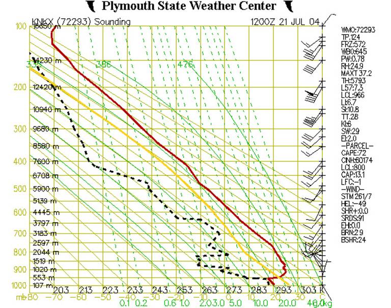 Fig. 5
We’ve now added the final elements to the chart - solid green lines, called saturated adiabats, that show the rate at which saturated air cools as it rises. The lines are somewhat curved as the saturated adiabatic lapse rate ranges between 2˚C/km to nearly 10˚/km(the dry adiabatic lapse rate), depending on the amount of moisture present in the particular air parcel.
As unsaturated air parcels rise, they tend to follow the dry adiabatic lapse rate. But, once they saturate, they then tend to follow the saturated adiabatic lapse rate. The yellow line reflects this. Since our air parcel has now become saturated at around 800 mb (Fig. 4), the slope of the line has now changed to follow the curve of the saturated adiabat (Fig. 5).
We can use the position of the yellow line relative to the position of the red line to see what weather conditions to expect in various locations. Wherever the yellow line lies to the left of the red line means that the air parcel is cooler than the surrounding air and will only rise by forcing (through vertical winds for example), and the atmosphere is said to be stable. These kinds of conditions lead to the trapping of air (and pollution). Wherever the yellow line lies to the right of the red line means that the air parcel will rise on its own, without any forcing, because it is warmer than the surrounding air; the atmosphere is said to be unstable. This kind of condition is more likely to lead to thunderstorms. For example, if an air parcel reaches saturation and is lifted to an altitude at which it’s warmer than the surrounding environment, then the level of free condensation (LFC) is reached. This type of a situation is an ideal environment for thunderstorm generation.
The image
below (Fig. 6) shows Tropical Storm Alex near the coast of the
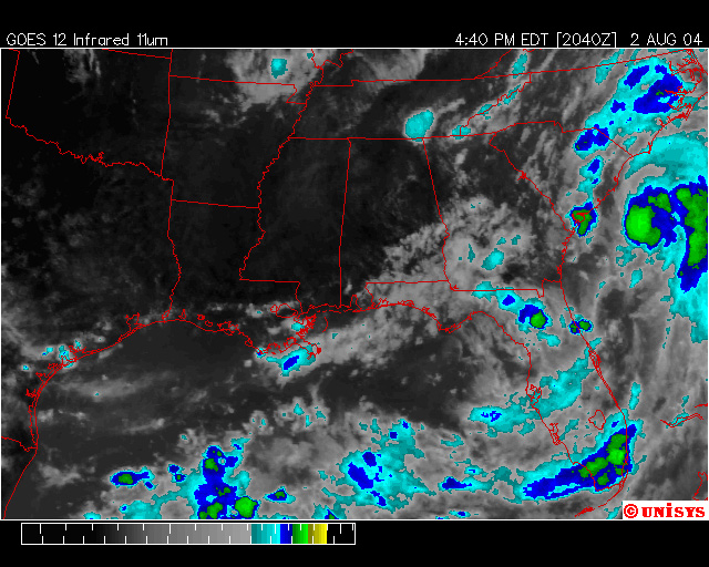 Fig.6
Fig.6
Figure 7
shows the accompanying Stuve diagram for
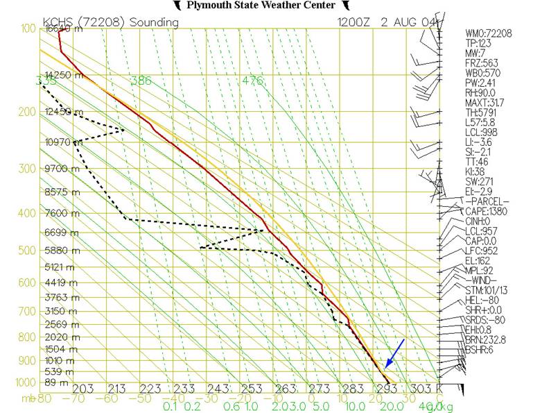 Fig.7
Fig.7
Figure 8
shows the Stuve diagram for
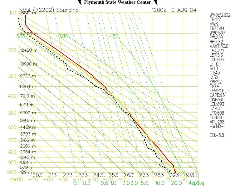 Fig.8
Fig.8
Written by Anna Huber.
Last updated,