Module IV notes : Graphs
This chapter presents three useful methods of presenting statistical data visually: The Bar Graph,
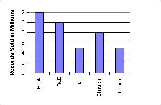
The following bar graph represents the annual number of records sold in five categories by store # 27 in the Licorice Pizza Records chain . As with most bar graphs the categories ( or classes ) are listed along the horizontal axis and the distribution ( number of records sold in this case ) is represented along the vertical axis.
To determine the total number of records sold by this store we add the individual numbers represented by each bar. For example , the jazz bar indicates five million jazz records sold .
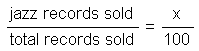
What percentage of the records sold were Jazz ? To answer this question you will need to set up a ratio involving total number of records sold and the number of jazz records sold as follows:
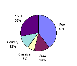
We can look at the same problem from a different point of view . This pie chart represents a different store in the Licorice Pizza Records chain : The pie chart makes it easy to visualize the type of music that is selling best as a percentage of the total sales picture .
If the total number of records sold was 50 million, and we want to know how many of the 50 million sold were
![]()
Solving for x would tell us who many of the 50 million sold were R & B .
a) If 150 million records were sold , how many of those sold were Jazz ?
We often see pie charts on news shows displaying what percentage of the U.S. national budget is spent in categories of defense , education , social security etc...
Line graphs make it easy to see areas of greatest increase in statistics such as sales , rainfall , unemployment etc... Consider the sales activity given in the following chart (graph) : 