Design Guidelines
OFFICIAL STATIONERY SYSTEM...
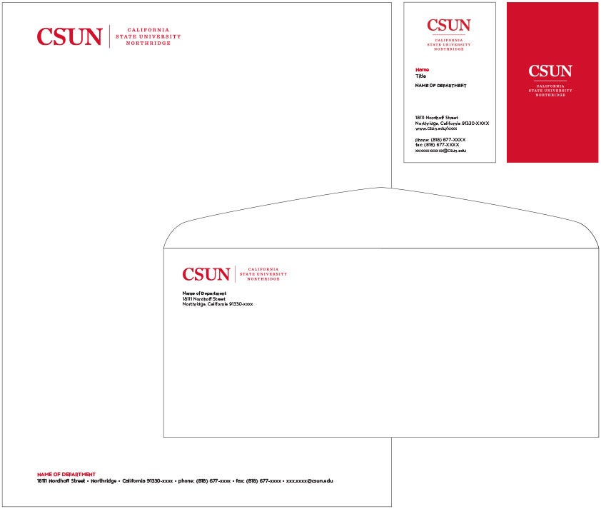
Stationery should be consistent campuswide. Please note the specific placement of each element. The official wordmark is placed prominently on the upper-left corner of each stationery item. The address block is left-aligned at the bottom. On the envelope, the department, college and address block is placed below the wordmark, noting the required area of isolation. On the business card, the individual’s name and degree(s) are placed beneath the wordmark. The areas of affiliation and college are left-aligned above the contact information. The secondary mark may be used on the reverse side of the business card.
SECONDARY LETTERHEADS
This image shows an example of a sub-identity letterhead.

PRIMARY COLORS
CSUN Red and Black are the “hero colors.” As such they should always play an important role on the page. Whether it’s highlighting the message or the most used color in a layout, these colors could be applied in various ways. Always use both colors for every audience and on all brand materials.
CSUN Red
Pantone 186C
C:11 M:100 Y:90 K:2
R:210 G:32 B:48
Web: #D22030
Black
C:75 M:68 Y:67 K:90
R:0 G:0 B:0
Web: #000000
SECONDARY COLORS
You may use the secondary colors as background colors or “highlight” moments on a page. Pick and choose which colors work best for your layout. You do not need to use every secondary color on a spread. At times you may choose to not use any secondary colors. They are only to help with visibility on a page when red, black and white become too limiting.
Secondary Red
Pantone 7417
C:4 M:86 Y:87 K:1
R:230 G:75 B:54
Web: #e64b36
Cool Grey 11
C:65 M:57 Y:52 K:29
R:85 G:86 B:90
Web: #55565a
Medium Grey Cool Grey 6
C:34 M:29 Y:29 K:0
R:171 G:169 B:169
Web: #a9aba9
Light Grey
Pantone 441
C:26 M:16 Y:20 K:0
R:189 G:197 B:195
Web: #bec6c3
TERTIARY COLORS
This palette is designed to only be used in subtle areas that complement the Primary CSUN Red and Black and secondary palette. Often only a small amount is needed and should never over power the primary palette. These colors often work good in overlay moments with photography or mixed in a gradient with the primary palette. Each color’s tint can be reduced to get the desired mix that works best with the Primary CSUN colors.
Sea Green
Pantone 3252
C:47 M:0 Y:24 K:0
R:130 G:206 B:201
Web: #82cec9
Periwinkle
Pantone 7451
C:43 M:31 Y:2 K:0
R:146 G:161 B:205
Web: #92a1cd
Golden Yellow
Pantone 136
C:1 M:27 Y:76 K:0
R:253 G:191 B:86
Web: #fdbf56
Iris
Pantone 526
C:77 M:82 Y:9 K:1
R:91 G:76 B:147
Web: #5b4c93
Azure
Pantone 2985
C:71 M:18 Y:1 K:0
R:44 G:165 B:218
Web: #2ca5da
Beige
Pantone 7527
C:15 M:13 Y:21 K:0
R:216 G:210 B:196
Web: #d8d2c4
CORRECT USAGE
If you would like, you may use as few as three colors, the primary CSUN red and black and a neutral color (or white). Using red as the main background color will help give your design the bold CSUN pride that it needs, especially applicable for undergrad, graduate and alumni audiences.

The color palette with athletics uses both primary and secondary reds as an overall gradient, which implies movement and pulse. The other secondary colors used are cream and tan, helping give it a warm, life-like quality.

Above is an example of using the primary colors as accent colors. The red rise arrow, paired with the secondary and tertiary palette, acts as an indicator to guide the reader towards the main message.
This example shows how a blending of the tertiary colors can serve as a basis for a layout and will allow for the main palette to stand out on top.
INCORRECT USAGE

Do not tint or screen back the primary CSUN red. To ensure the message is clearly readable, avoid using tone on tone colors.

Do not use the old red (PMS 201) in the color palette. Avoid using it on anything from athletics to internal marketing materials.
The secondary and tertiary colors should only be used to support the primary CSUN palette. When creating layouts, establish the primary colors first, then when necessary, use the additional palettes.
PRINT & WEB
Like colors and imagery, fonts play an important role in the visual aspects of the university’s identity. The only typefaces that should be used moving forward are those listed below. It’s important to keep the brand unified by using ATC Overlook and FS Lola whenever possible. Especially on all outward-facing marketing or advertising.
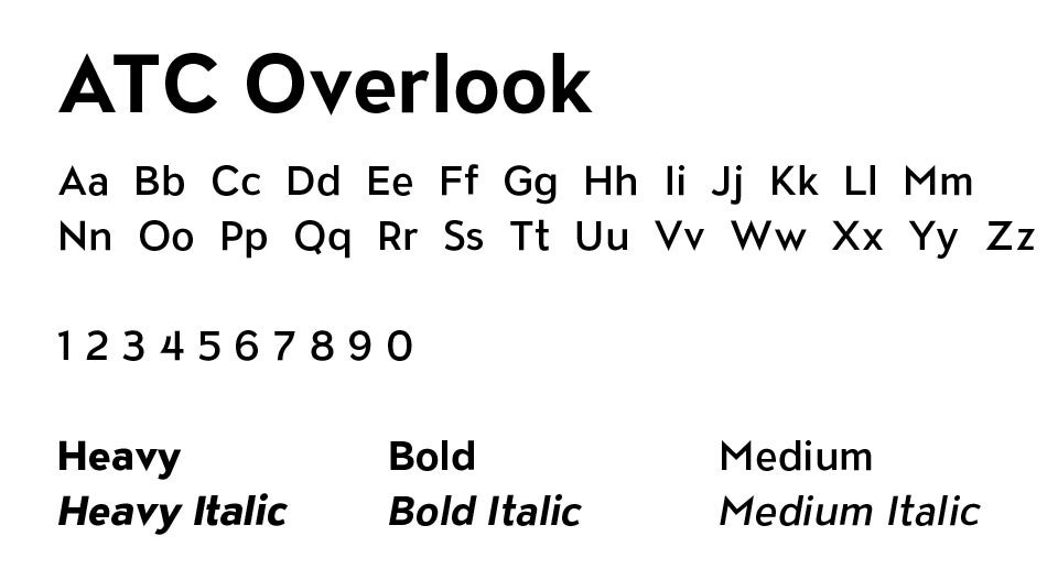
HEADLINE
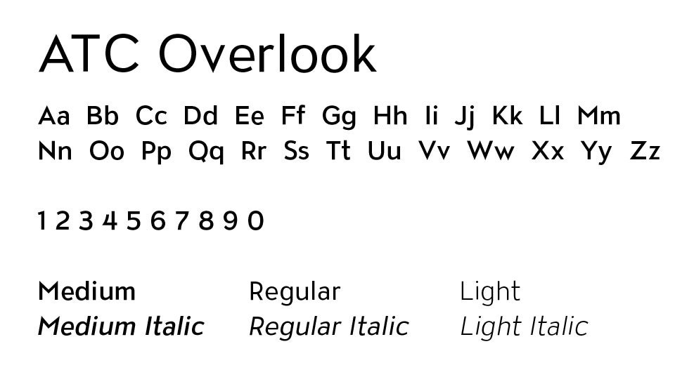
ATC Overlook should primarily be used for headline treatments. Only use the weights listed below. Using bolder weights will help text feel more like a headline.
ALTERNATE HEADLINE/SUBHEAD
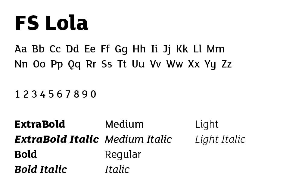
FS Lola should only be used occasionally for headline treatments. It would be best used when variation is needed for larger combination headlines. It may also be used for perspective type treatments.
BODY COPY
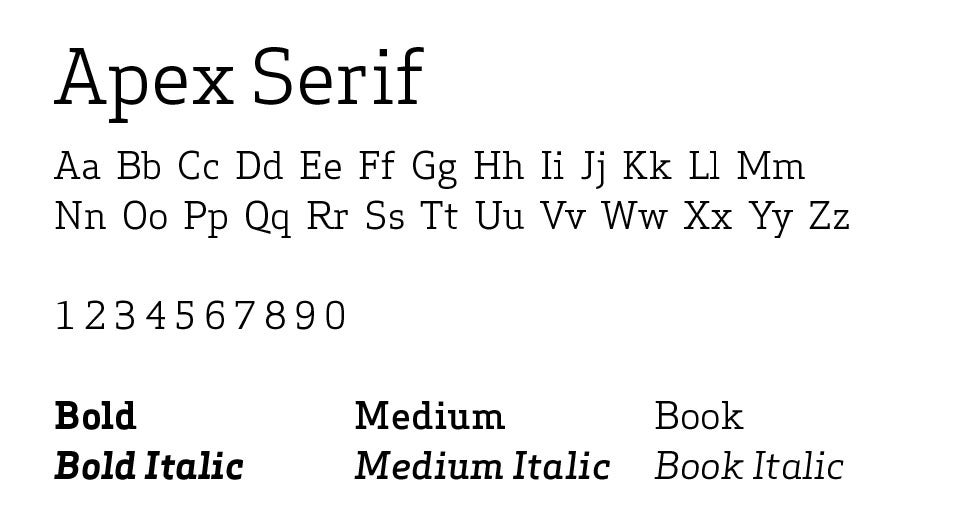
Apex Serif should be used for body copy. This serif pairs well with ATC Overlook and FS Lola, yet allows greater readability in long form copy. Do not use anything too bold or too light, otherwise it will not be easily readable. It should also be set at a size with reasonable leading so that it can be read in large blocks.
SECONDARY BODY COPY
ATC Overlook can also be used for secondary body copy. It can be used to set sections apart from the main copy such as in sidebars, pull quotes and subheads.
ALTERNATE OPTIONS
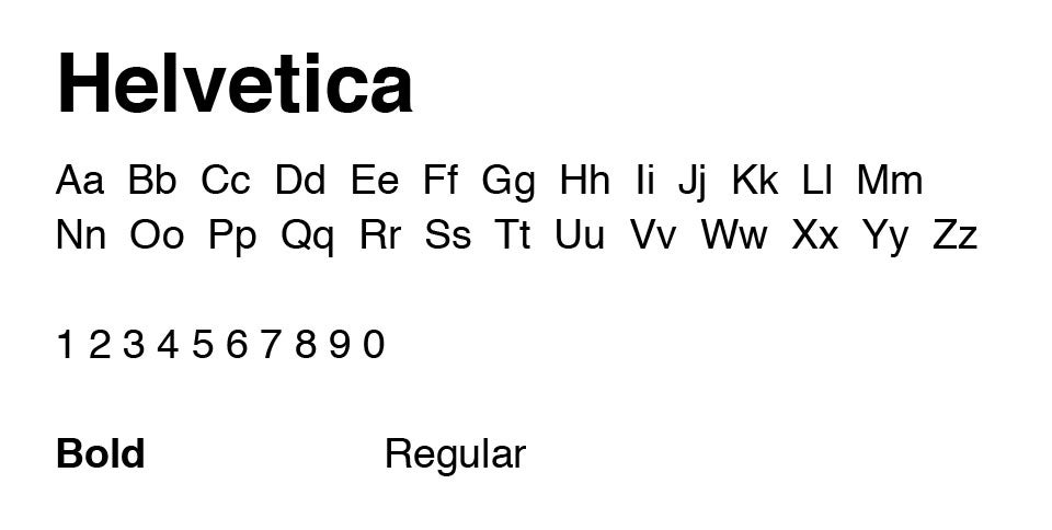
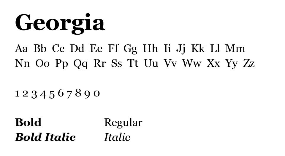
If for any reason the fonts ATC Outlook and FS Lola are not available to you, use Helvetica and Georgia as alternate options. These fonts are packaged with the Microsoft Office suite.
HEADLINES
BODY COPY
ALTERNATE BODY COPY

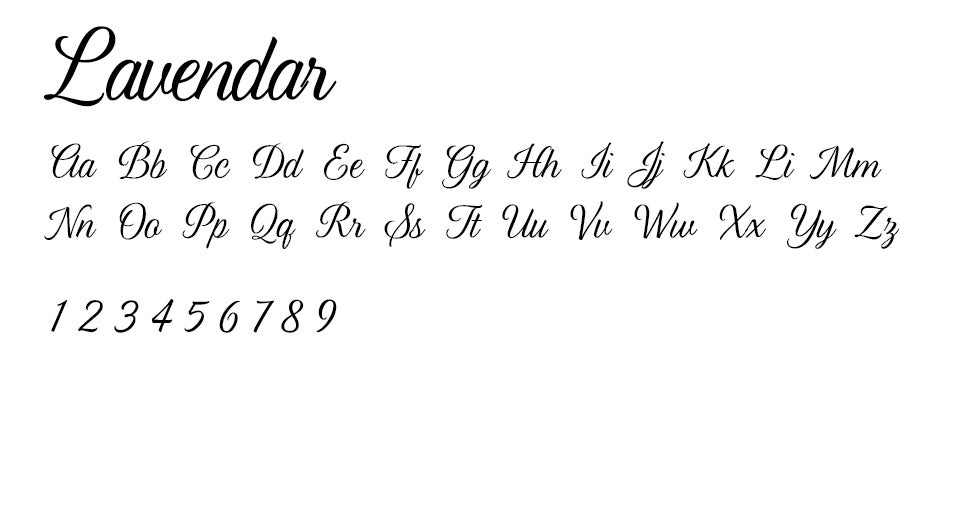
SCRIPT
Occasionally, a script font can be used for a more formal impression on communications such as a Gala Invitation.
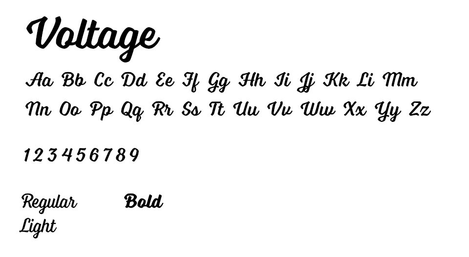
SECONDARY SCRIPT
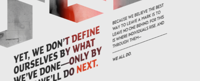
This secondary script font can be used in headline lockups to separate two sections of a line. This works well with connecting words such as “yet” and “and.”
HEADLINE TREATMENTS
There are a few different ways to treat headlines that may range from complex to simple. Please note the examples for each headline application below.

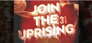
Digital Headlines
When the headline is used as the main image, use a variety of sizes, weights, etc. to create something that’s visually appealing and calls attention. You may also use light shadows and letter inlines (as shown in “100”) to give the design a 3D effect.

Standard Headlines
For shorter headlines, use a simpler variation of fonts and weights. Scale and italicizing can also be used to emphasize certain words.

Perspective Headlines
At times, vertical treatments can be used to call out specific words (like “work force” shown above). This could also be combined with perspective treatments, to make the type appear to be on a different plane, moving upward. Only use this application when it is the main image on the layout.
Athletic Headlines
For Athletics only, use this layered type treatment to provide a bold aesthetic. The layers underneath should be similar to those shown in the example—outlined letters and solid letters with 50% opacity applied.
BODY COPY TREATMENTS
Legibility should always be the primary objective of body copy. Ensure body copy is always readable in the space that it occupies.

Longer sections of copy should utilize the Apex Serif family to ensure maximum readability. Break up long sections of copy with graphics or text such as quotes in order to keep the page engaging.
As a framing device, when appropriate, use a vertical line on left justified body copy that comes from the top (preferred) or bottom of the page.
You can also use italicized type slanted upward. Use this style on callouts and quotes, paired with slanted graphic elements.
THINGS TO AVOID

Do not use perspective type treatments that lead downward.

Do not use brand elements and type treatments directly over the subject matter.

Ensure that proper spacing is used in all headline treatments.

Avoid using thin type for headline treatments. The identity of CSUN is bold and strong, not delicate.
THE RISE ARROW
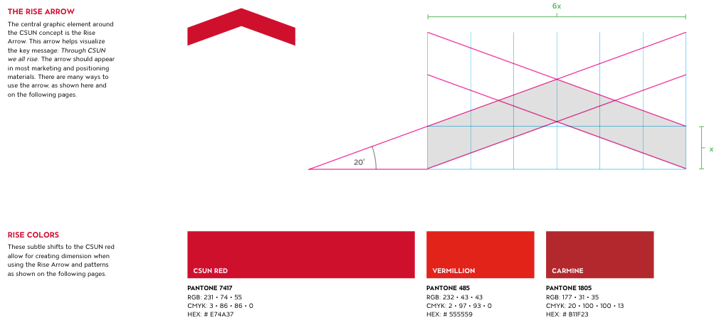
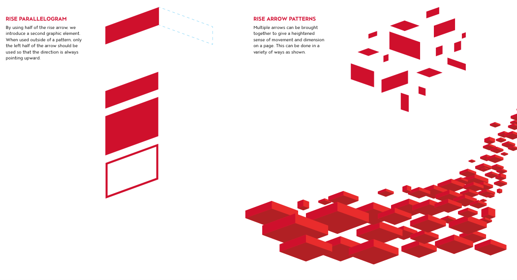
CORRECT USAGE

The rise arrow can be used to separate two sections of a layout to call attention to specific headlines or sections of copy by guiding the reader’s eye.

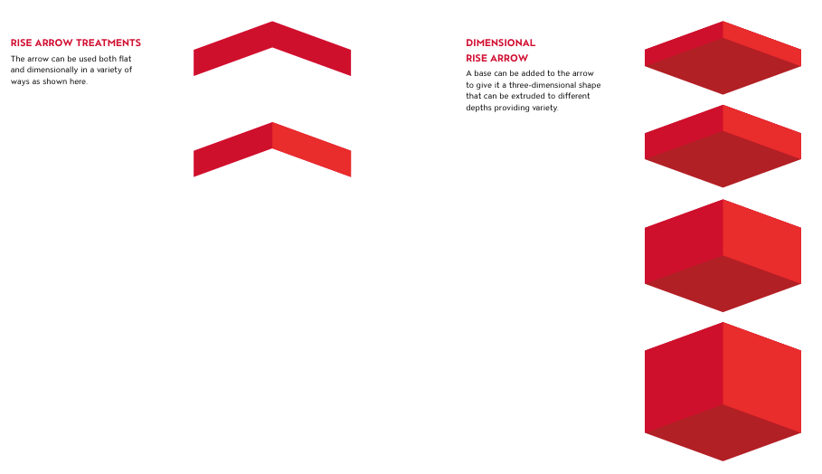
The arrow can be duplicated and layered in ways that help create dimension in the space.

It can also be treated as a three-dimensional object on a page when other dimensional objects are projecting up from it.
RISE ARROW PATTERNS

This page shows some examples of how the Rise Arrow patterns can be used in layout.

The Rise Arrow could also be used as a subtle background pattern, scaled and sized in various ways. This also tends to work with vibrant color gradients.
When appropriate, the arrow pattern can integrate into the type treatment.

Instead of using the 3D Rise Arrow as a pattern, it could also be fragmented and applied in an organic way. In this example, each rise arrow is split in half and at about 40% opacity with gradients applied. This works great with perspective typography.
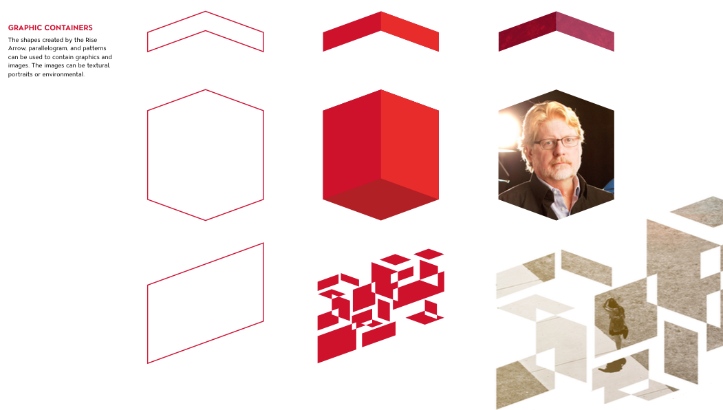
LINES AND SHAPES

This is another example of the rise arrow being fragmented to imply motion. It works best with images that show movement.

Use thin lines that mimic the rise arrow and enclose or book-end vertical headlines.

In some cases, the graphic could extend out in both directions to act as a container for certain imagery. This works best with portraiture.

Use of subtle and tasteful dimension in background elements can help differentiate type as well as other content.
DIMENSIONS

The visual elements of rise can displayed in various ways. One way is by using dimension to give the appearance of certain shapes floating off the page. In this case the rise shape is splitting the image in two parts. The portion of the image in the rise shape is slightly lifted by the use of a drop shadow and slightly nudging the photo to show more perspective.

Dimension can also be created when using large headline moments. From creating a hard dimension of the letter forms and pairing it with a soft drop shadow that adds perspective to the type and creates the appearance of type floating off the page.
THINGS TO AVOID

Do not use the rise arrow pointing down.

Avoid creating a long shape out of the rise arrows.
Graphic elements should support the message, not take over. Avoid creating elements that distract or overpower the content.

Do not place graphic elements over a person’s face.
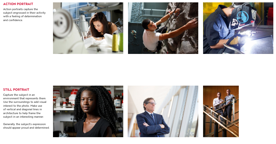
PORTRAIT
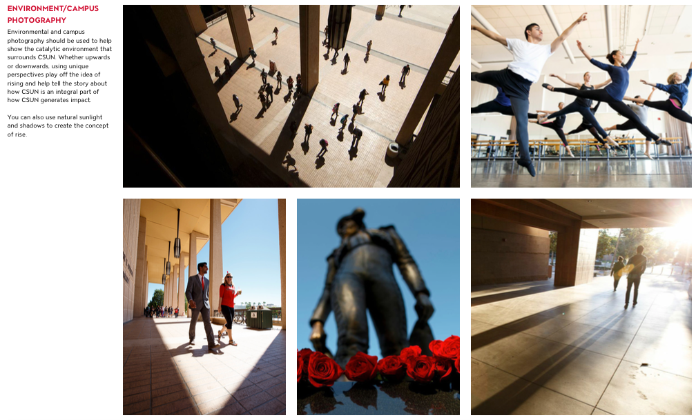
ENVIRONMENT/CAMPUS IMAGERY
TREATMENTS

Subtle color overlays help create energy and support the action of the photography. This treatment works well with undergraduate audiences.

Monochromatic photography should be used for textural backgrounds to help give a layout more context. This is also a good example of where to incorporate more elaborate headline treatments.

In Athletics, the mix between movement in the photography and more textural overlays frames the content and helps showcase the power and excitement of CSUN athletics.
THINGS TO AVOID

Do not use photography with unnatural poses of students studying.
Avoid overused, cliché subject matter such as groups of students gathering on campus lawns.

Portrait photography should have the correct amount of contrast and always be clear and visible.

Do not use any images that feel like generic stock photography. Avoid using photos that have white studio backgrounds.
VIDEO AND PRESENTATONS
Videos have the power to inspire people, evoke emotion and provide knowledge. Visual storytelling is key to having a well-constructed video. Words and graphics are not enough; the story must be painted visually. Stories should be told with clarity and brevity. Impactful, concise stories with strong visual imagery will leave a lasting impact on a viewer.
VISUAL CONSTRUCTION
Videos should be constructed with some basic elements in mind:
- Come up with an idea
- Tell a story
- Remember people are interested in people
VISUAL TREATMENT
Our videos portray the campus as warm, welcoming and elevating. Visually, shots are a warmer color temperature rather than a cooler temperature. It is important to portray on-screen talent in their best light. Shots of the campus should portray confident and proud students, staff and faculty.
BUMPERS
The CSUN logo should only appear in a bumper at the end of the video. The ending bumper will also contain each department’s wordmark. The bumpers are short and concise.